8 Tips to Build UI for Web Applications that Retain Users
You have less than a second to impress users on your web page, and about 10 seconds (often less) to convince them to stay. How do you do that? With high-performing and useful web app UI.
Intuitive and elegant web application UI design is one of the pillars of strong user engagement, customer trust and loyalty. And we are going to talk about how to create such design for your web app in this 5-minute post.
There’s no sugarcoating here. Users will often judge your online service or product by its design. Based on their experience, users decide if they enjoy your product or service, if they want to use it again, and even if they trust your brand. Shocking, but the numbers don’t lie.
This is especially true in the case of UI web application design because web app interface is usually the main if not the only interaction users get. Unlike a static website that only showcases products or services, a web application, in most cases, IS the product or service. It is characterized by highly interactive dynamic interface that users may sit in for hours to complete their tasks (e.g., manage invoices, sort out images, create online presentations). So it must be fast, responsive, and easy to figure out and use.
How to create web application UI design that enables all this and converts online users into loyal customers and clients? Let’s get straight to it.
Start with user research
Convenient interface must resonate with user needs, expectations and tech skills. This is why it’s so important to start web app user interface design with user research. It is the fundamental step in the UX/UI design process and the key principle of user-centered design – an iterative design approach that puts user needs and expectations at the center of the web application development process.
Using various research techniques (user personas, user interviews, focus groups) you gather essential information about the audience of your app. These insights serve as the basis for nearly every design decision you will make on the way. So you will never have to start with a blank page.
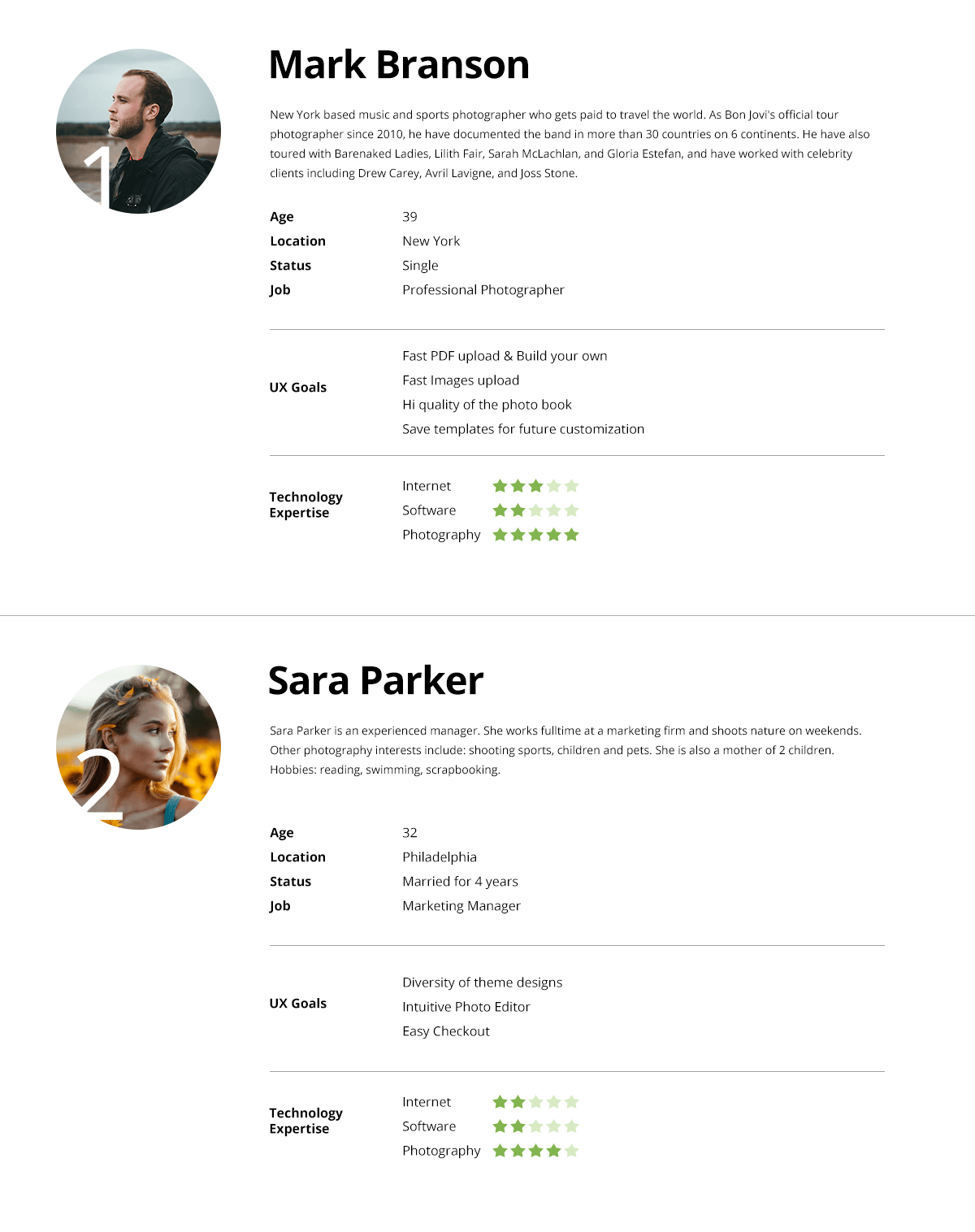
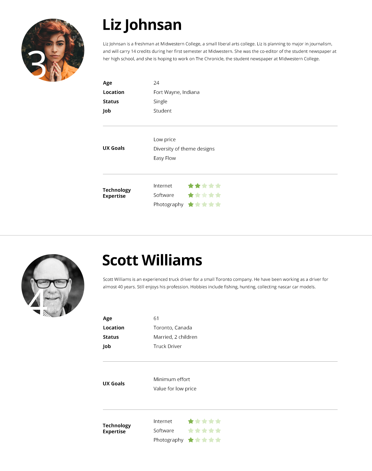
Example: User persona report for a highly-intuitive web application that helps amateur and pro photographers create photo books online.
Stay consistent and create UI patterns
Stick to consistent, reusable, and repeatable design solutions for similar tasks throughout your application. It will help you minimize the learning curve and make sure users get a hang of your web application fast. Even though they may be dealing with unfamiliar features or services.
It is particularly important when you build UI design for web application with dynamic dashboards and data visualizations that show different metrics across various views. Consistent color codes, fonts, and navigation will help users quickly grasp patterns and move along their journeys.
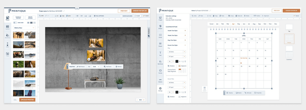
Example: Our long-standing client, Printique offers several online photo editing tools for building calendars, wall prints, photo books, and other products. Even though the functionality of each app has its specifics depending on the product, the navigation and similar features are designed consistently across every tool.
Provide users with clues
Web app has an interactive interface. There are many elements to click, drag, hover, open, edit, fill in, view, etc. Providing various cues and hints will help users easily discover and figure out these elements and make the interface intuitive. Depending on the type of action and a specific scenario, you can use:
- descriptive placeholders
- changing hover states
- on-hover controls for quick actions
- links and hints to the next actions
- progress lines
Consider also adding training media, screenshots and guides for newly signed-in users and freshly released features.
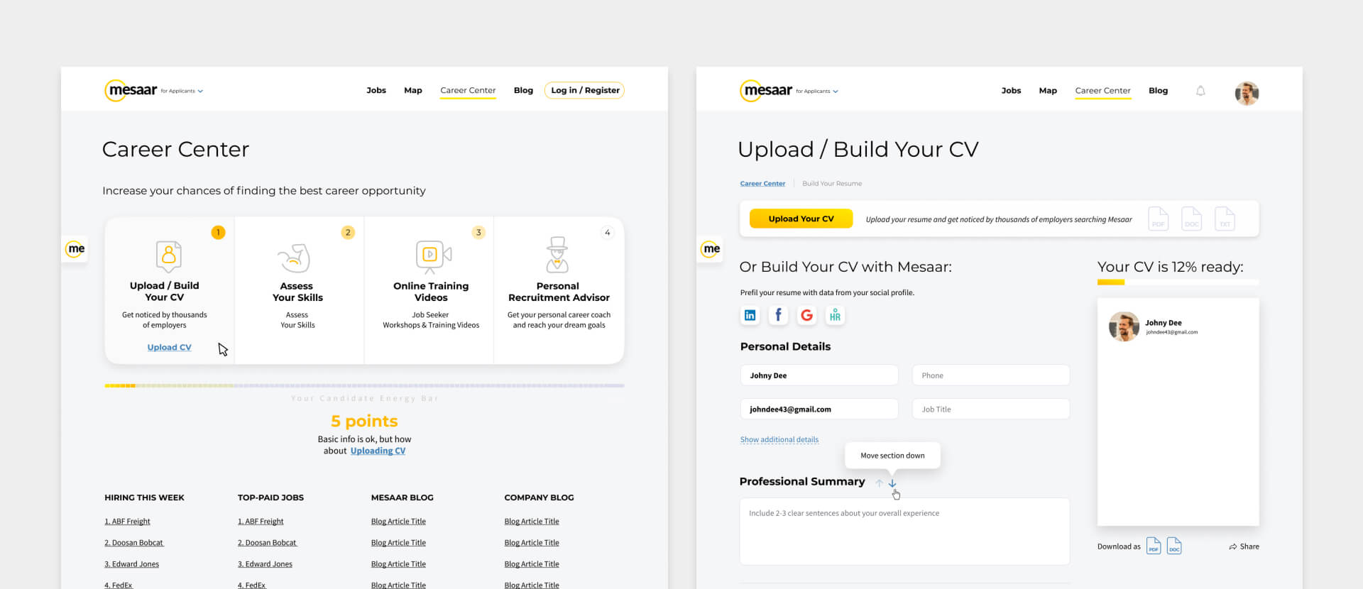
Example: When revamping web app UI for a global job portal, our design team introduced a dynamic progress line with changing state for completed steps. It navigates users through each application step and dynamically changes status as they progress.
Leverage color, shape, and size to convey meaning
Color, shape, texture, size, space. You can leverage all these design elements to emphasize certain actions and guide users on their journey. For example, highlight the one most important button with a color that contrasts with the rest of the page and make secondary actions accessible via a simple link. Or shade and disable all actions on a page when a user fills in a form in a pop-up.
This approach often appeals to our previous user experience (familiar patterns) or our lizard brain. Or both.
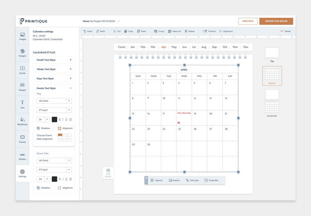
Example: See how the most important call-to-action to order a calendar stands out from the rest of the page, while a secondary CTA to preview the product sits on a subtle button.
Create a responsive interface
It’s a bit embarrassing that we still need to talk about this. One of the top reasons why users leave a web page is non-responsive design. Responsiveness includes not only how your app’s layout adjusts to various screen sizes. It also reflects how it addresses the needs of users on different devices.
Does an app on mobile or tablet provide the same value as its desktop version? Can you preserve all essential features while changing the layout? To make sure it does and you can, follow the rules of responsive design and create responsive breakpoints when designing UI for web applications.
This leads us straight to the next point:
Consider screen constraints
Responsive game moves to the next level when you need to design a complex data-intensive web app with myriad dashboard views and visualizations (lists, graphs, charts, tables, etc.). Because you will have to deal with screen constraints. And screen constraints seriously affect how you navigate dashboards, manipulate and drill data, build and view reports.
This is when user research comes in handy. Based on these insights, you can create an efficient data representation model, useful filters and features that will enable easy navigation across dashboards even on small screens.
Adapt to response speed
Load time and response speed seem like the job for engineers. And it is, because it mainly depends on what’s under the hood. Web application UI design, however, can also play an important part in this story.
By default, your web application must be fast. As in brain-defyingly fast. Users expect an app to immediately respond to their commands, otherwise – buh bye conversions. Especially when we talk about highly interactive interfaces such as web editors or streaming services.
But what can you do when an application does need time to load, for example, to compile a 20-page report or upload 500 megabytes of data? Then, you can apply to design to help users cut through waiting time. Good ol’ loaders or dynamic completion status (we are loading… we are compiling… we are adding a final touch…) inform users that your application is on it and prevent them from dropping off. Or you can use something even more creative.
Example: When we were working on a web tool for photo book building for Printique, we figured that some users drop off at the waiting time when they load megabytes of image data. So we added a feature that lets users manage photos in thumbnail format while full-size images load in the background. Saved the day.
Test accessibility and usability
The moment you create UI web application design and hand it over to engineering, you move into the second leg of your journey. Because design is not a step. It’s an iterative process.
Accessibility and usability testing are useful techniques that help you challenge your assumptions and see how your design solutions perform in the field. Usability tests will evaluate how actual end-users perceive your web app UI. So you can circle back and make changes based on real user feedback.
Accessibility tests will determine if everyone who wants to use your app can use it. Depending on the needs of your audience (another flashback to user research), you may want to add adjusting fonts, text-to-speech features, and even change the entire color scheme if it doesn’t work for visually-impaired users.
Need help with your web app design?
We will design an elegant web app that strengthens your credibility, delights your users and helps you achieve your business goals.
SHOW DESIGN SERVICESNow that we talked about useful practices of UI development, let’s mention a few things to avoid when creating UI web application design.
Ignoring user feedback
Ignoring insights from your audience is like shooting yourself in the foot. User feedback is priceless because it is one of the most cost-effective and easy ways to find out where your design wins and where it falls flat. To gather these insights, you can use focus groups, rake through reviews, set up heatmaps and customer surveys.
Ignoring design process
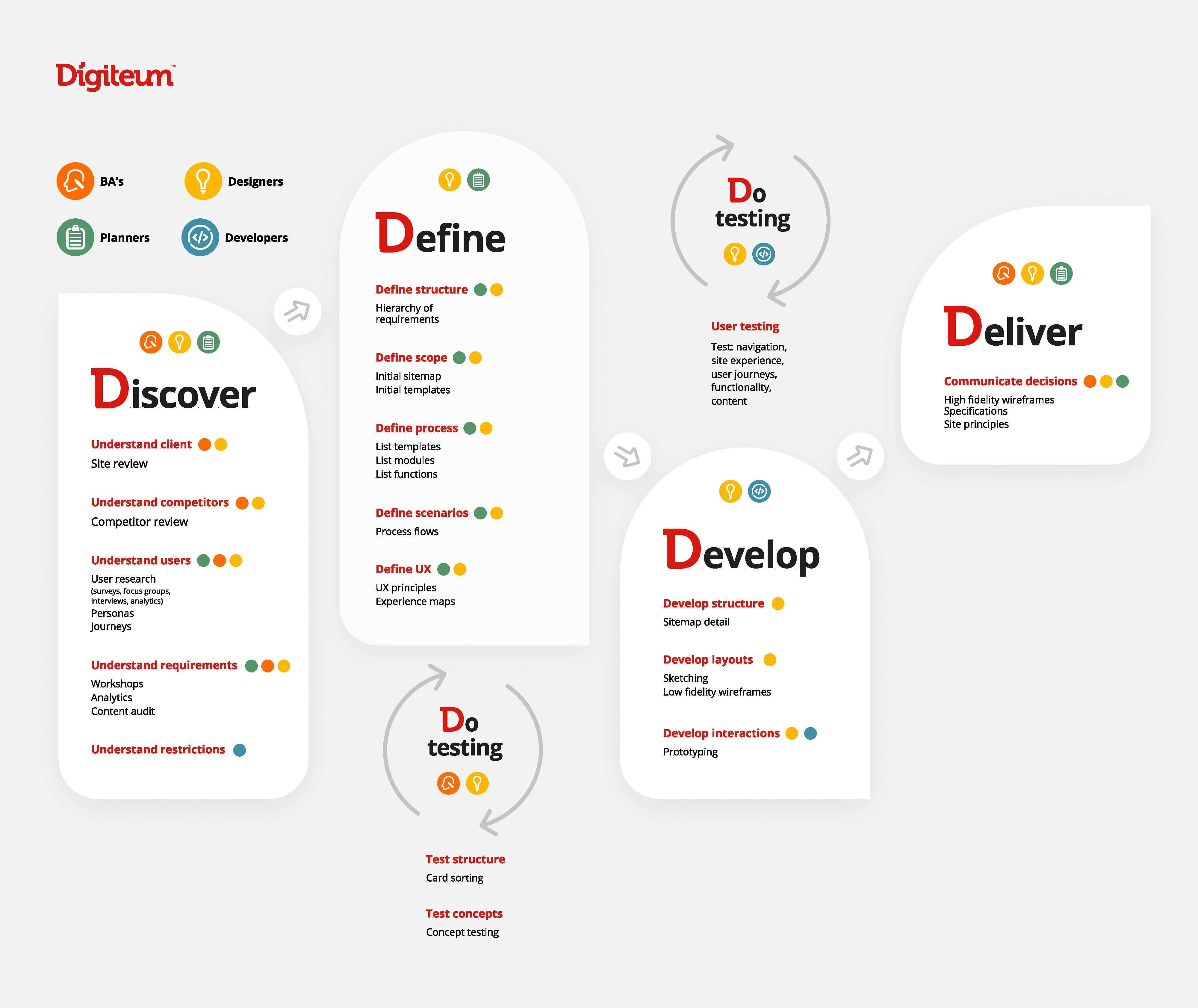
According to the Senior UX/UI Designer at Digiteum, deviating from the design process – poor planning, insufficient data, skipping phases – is also a bad idea. Instead of saving time it leads to more iterations and requires allocating more time and resources for user interface design in web app development cycle. So as the opposite of poor planning – micromanagement.
Cluttering
Try to get too many valuable things into too little space and these things will quickly lose value. According to GoodFirms, nearly 85% of design experts believe that overloaded web design is the top mistake companies make when expanding to online space. To avoid cluttered UI design for web application, focus on its clarity, readability, and discoverability of features (how fast people can find what they came for on your web app).
Treating the mobile version as a second-tier
Another shocking number (last one, promise): 94% of people will judge your web page based on how well it performs on mobile. This is enough to never treat the mobile version as a second-tier. So when you work on UI design for web app, make sure it will be equally useful and delightful on any device.
Access more than a decade-long expertise in UX/UI design and web development to create a user-centered application that wins over your audience and generates revenue. Our senior design team covers the entire cycle of web app design from discovery to prototyping and optimization.
- End-to-end web app and website design development services.
- Dozens of successfully delivered web design, revamp and modernization projects (Printique, Oxford University Press, NextGate, Mercans, Lymphoma Research Foundation, Overfli, etc.)
- Design for enterprise and startup clients from the US, Canada, UK, Switzerland, Netherlands, Germany, Italy, etc.
- Award-winning applications Focus on Lymphoma, How Do I, Oracle Cloud Day, Printique.
- Time-tested design process and practices.
Build intuitive and elegant web app that your users won’t get enough of
Combine rich functionality, fail-proof performance and impeccable look for your web application.
HIRE DESIGN EXPERTSQuick round-up
- Quality UI web application design is focused on user needs and therefore enables strong engagement.
- Several design practices and tools such as user research, usage patterns, responsive design, and testing techniques help create an intuitive and thoughtful web interface.
- It’s essential to follow the design process, focus on responsiveness, clarity and usability to avoid overloading web interface and making it hard to figure out and use.


